One of the most discouraging statistics for all app professionals out there is that people abandon the majority of apps they download, some even after using them just once. Sure, we might have spoiled users a bit by creating awesome apps, and they might have gotten used to getting crazy good products, but we can’t lay the entirety of the blame on their standards.
The good news is, there are ways to tackle app abandonment, and as with any other problem, it starts with becoming aware you have a problem. The next step is to try and understand the reasons behind app abandonment. Only then will you be able to formulate quality strategies and execute them.
Below you’ll find some of the most frequent reasons why people abandon apps, as well as tips and tricks how to eliminate them.
#1: Your onboarding experience isn’t top notch
The users’ first few moments with the app are the ones that usually define if they’ll stick around or not. So, first impressions are crucial to user retention and therefore, need to be executed flawlessly.
First impressions are usually generated through user onboarding – the short tutorial, hinting, or guide how to use the app, and that’s the first thing you should keep an eye out on, especially in terms of quick abandons. Preferably, pay a little extra attention to it.
After all, the user’s first moments in the app are the moments that define habits and create bonds. An awesome user onboarding strategy will make sure users think highly of your app, and that makes for a great start.
User onboarding is serious business, but it should not be too hard, for both the user and the app pro. It will differ, however, depending on what your app is about. Sometimes, just a couple of screens with a few short and clear pointers to the app’s main features is enough to get the users rolling. In other cases (for examples, with games), it would be wise to create a ‘progressive onboarding experience’, where users are gradually and progressively taken through your app, gestures and controls, and everything it has to offer.

Image Source: Appsee
Helping users solve a problem, or get something done, is what should be at the very core of every onboarding process. Yet, there are multiple ways you can get user onboarding wrong.
General errors when it comes to onboarding design are usually asking too much information from the users right from the get-go, or throwing all hints and guidelines into a single screen. Asking too much information can make users see your app as not trustworthy (something we’ll be covering further below), and putting all the information on a single screen can be a bit too overwhelming for users and can scare them away.
To make sure you don’t make these mistakes, don’t force users into registering right on the first screen, and explain to them why you need the information you requested. Also, if your app is filled with features, you might want to create a progressive onboarding strategy, where users get gradually introduced to the app, as they use it. Finally, don’t forget to add the ‘Skip’ button, so that users who might already be familiar with your app do not have to go through the onboarding process again.
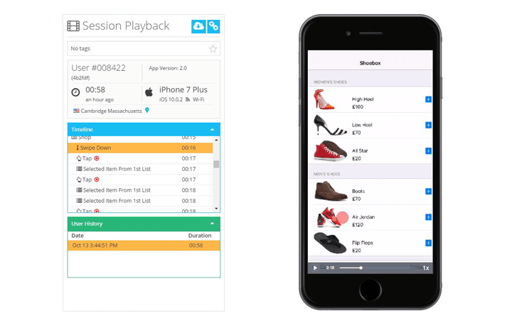
Luckily for everyone, user onboarding is something that can be monitored, analyzed and tweaked, so make sure to use all the tools at your disposal. The qualitative analytics tool, Appsee, enables you to visually track user behavior during onboarding. For example, if you’re unsure how to go about your onboarding strategy, you can implement an A/B test and then utilize qualitative analytics tools like user session recordings to confirm which approach is more compatible with your users. This qualitative data can help you obtain actionable insights on your app and guarantee the utmost positive onboarding experience for your users.
#2 Your app isn’t trustworthy
User privacy is one of the main reasons why people decide to abandon apps. Mobile devices, besides being extremely useful and a virtual part of our lives, are also extremely personal. They hold a bunch of our private data, including contacts, social media login information, banking data, geolocation information and so on. Not to mention photos and videos! Things like the Edward Snowden event, Yahoo, LinkedIn or SWIFT breaches, the ‘Fappenings’ and all of the media coverage on how everyone’s trying to steal and abuse our personal data has made users extremely careful about who they trust.
And when it comes to mobile apps, that vigilance is most clearly seen through a few things: in-app permissions, registration and data handling, sharing, and advertising.

Image Source: How To Geek
The best way to make sure people don’t abandon your app is to communicate clearly and concisely which permissions you need, and why you need them (the why is extremely important). We’d advise you to make app registration an option, and not a requirement, and to clearly state which methods you’re using to make sure user data does not get into the wrong hands (you can use Terms and Conditions to communicate this message). And please be extra careful when it comes to sharing.
Some people consider it embarrassing when an app posts something without their approval. Others might be considered ‘spammy’ by their friends if an app keeps posting things for everyone to see. Giving users total control over sharing, and not posting things on social media without their permission is crucial. If all of the things mentioned here are accounted for, you will come off as trustworthy and thoughtful, and those are the qualities which make users stick around.
#3 Your gestures are counter-intuitive
When reviewing an app or software, one of the main things a lot of reviewers pay attention to is the so-called learning curve, or intuitiveness. It revolves around how much time users need to get acquainted with the app and its features, and learning the app’s navigation gestures is an infallible part of that curve. Mobile app users are almost always on the go, and they don’t have the luxury of time to sit down and learn a mobile app, as they could do with a desktop app. That’s why one of the main reasons why your app might get abandoned is counter-intuitiveness. Mobile users don’t have the patience for the slightest bit of confusion in their UX. In other words, users need to know how to use your app after investing just a few moments in it. The simpler the designed gestures, the better it is for the app’s overall usability.
Image Source: Pixabay
Everything about the app’s user interface needs to feel natural, quick to learn. That’s why both Google and Apple have user interface guidelines, and why some apps on both platforms *feel* the same, in a way. For example, virtually every photo management app (and a few mapping apps, gaming ones, as well as cameras), use the same pinch-to-zoom gesture. Sure, you could double-tap, or scroll at the edge of the screen to zoom in on some of them, but they all offer the same zoom-in and zoom-out gestures. That’s because it’s easy to associate the pinching gesture with actually pulling something closer in the physical world – it just like something we’d learned before. And that’s what it’s all about – being intuitive. Being known, logical and easy to use.
So how do you tap into those habits, besides following Google and Apple’s guidelines? By analyzing user behavior, of course! Qualitative analytics can help you dissect why people behave a certain way when using an app, and you can use that information to improve your user interface. For example, you’ll notice that just 35 percent of users access one of the main features of your app. Upon closer inspection, you’ll notice that they’re trying to swipe to use that feature when instead they should be double-tapping. By adding a small hint to teach users how to use the feature, or changing your gestures to better reflect what they think should be done, you’re most likely reduce app abandonment.
#4 Your ads are offensive or annoying
Users are quite aware of the fact that ads are the reason why they get free apps. Users love free apps, so they’re willing to tolerate ads, and consider them something of an unavoidable annoyance. However, many still consider them exactly that – an annoyance. If you’re not careful about the ads’ content, placement, and frequency, that annoyance might just tilt the delicate scale in favor of the app being deleted.
So yes, you may add advertising to your app, as long as you consider them placing carefully. Among the more common reasons why ads prompt users to delete the apps are:
- Inappropriate, offensive ads
- Too many ad positions
- The frequency of pop-up and interstitial ads is too great
- There is no “exit” button
- They’re not relevant to the user base
- They are disruptive
Imagine if you gave your five-year-old your tablet to play a game, and he or she ends up viewing a graphic war movie. That’s how you lose users to inappropriate, or offensive ads. Or if an app’s screen has more ads than content. Don’t forget that some people pay for mobile data, and if a lot of that data is spent on being served ads, it’s not going to end up well.
Or if (and this is something we come across way too often) your puzzle game serves an interstitial ad every time a user restarts a level? That frequency of interstitials is way too great. And if it just so happens (and boy, does it happen) that the interstitial doesn’t have (or has a very, very tiny) an exit button, you can be absolutely certain you will lose a bunch of your users.
Instagram is a great example of a well-built ad system. Its ads are made to look just like any other post in the app. They are not disruptive, their frequency is just about right, and you only need to swipe up to remove them. With proper monitoring, to make sure no inappropriate or offensive ads get through, Instagram has created a perfect ad system that blends seamlessly with its app.
Another solid example of how ads can be used (and not be a detriment to the app’s UX) is one of the most popular puzzle games, AA. In it, ads are placed in the bottom of the screen, where they don’t interfere with the game. After finishing a level, when the user is happy and taking a naturally-occurring break (between levels), an interstitial ad is served. Not too aggressive, not overwhelming – just about right.

Image Source: 148 Apps
#5 You’re pushing it with the push notifications
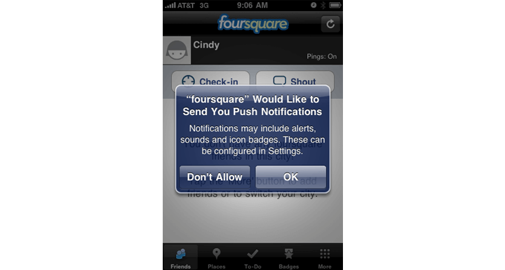
Image Source: Flickr
One of the worst things that you can do to your users is to be annoying, and if you’re sending too many push notifications, you’re definitely doing it wrong. Even though it might sound trivial, in practice it’s very dangerous, as it can make people abandon apps. Push notifications are a great communications and engagement tool, and when utilized properly can do miracles for your app. However, if you don’t exercise restraint – it can completely ruin you. The worst part is, once you’re labeled as annoying, it can really hurt your brand. That can be even harder to remedy.
But how do you hit that sweet spot? It can’t be the same for all apps, can it? Of course not. It is very important to properly analyze who your target audience is, and then optimize push notifications accordingly.
For example, if you’re running a sports results app, it makes sense to send push notifications a couple of times a week (maybe even a day), especially on game days. People who track sports results will want to know as soon as their favorite team scores. As results change multiple times during a game, it is generally OK to send a couple of push notifications.
However, if you have a travel app, there’s probably no need to offer new hotel deals every other day – there aren’t that many people traveling that often. Obviously, it would be impossible for us to tell you exactly how often, travel apps, in general should send push notifications. The best way to answer that question is to test, test, test. You can start with a lower frequency and then slowly increase it, while carefully monitoring how people react. As soon as they start opening the app just to get rid of the notification, you might have overdone it.
Having push notifications is a great tool for your app, but only if it’s not being abused. The type of push notifications reaching your users is also an important element. We are living in the age of personalization, where users expect the served content to be relevant to them and their interests. Based on user preference, and use history, make sure the push notifications are relevant to each user. App personalization is one of the best ways to retain users – they will feel as the app is really catering to their specific needs.
Final thoughts
If you want to hold on to the people that are already using your app, and make sure you attract others, you need to take a step back and take a look at several facets of your app(s). If you recognized them in any of the five reasons listed here, we’d advise devoting your full attention to these issues until they are resolved. Your users need to be happy if you want to consider your app successful, so start focusing on what’s important – right now. Having plenty of downloads is a significant metric, but so is having satisfied users.