Referral Marketing is a pretty nifty tool, especially when it is clubbed with your app. It can bring superb results to your marketing campaign and seems to work each time!
Once burgeoning (and now swift) startups like Airbnb, Dropbox, and the likes are apt examples of this strategy implemented the right way.
Don’t get me wrong when I say that it may not always stand true.
A lot of this is due to a failed or moderately successful first attempt at app referral marketing.
It’s all about sharing a link. What can go wrong here anyway?
App marketers often foresee referral marketing as a smooth marketing tactic, something that is absolutely glitch free. What can go wrong with a ‘refer a friend/word-of-mouth’ campaign when the perks are so exciting? Isn’t it all about sharing the link?
The answer is NO.
Your app users may love the rewards/incentives associated with it but won’t recommend it unless it excites them at the first place. Believe me when I say that a lot goes in making a referral marketing campaign the next Airbnb, UBER or Buffer.
Most app marketers fail at it, thereby losing faith in app referral marketing entirely.
But here’s the good news. A few checks in place can change the way this tactic can help your app to grow . Let’s explore these tips through this article.
Promotion
An agile app referral program involves various steps that need monitoring. That being said, most marketers try to treat an app referral program like its web counterpart. Considering the offbeat nature of an app referral program, that’s where they make their biggest mistake.
For example, a marketer who is aiming at web referral has to factor only the fastest way in which its users discover the referral link. The next obvious step is when the user shares it within their circle. However, the most essential step still remains to be the conversion on these links, without which this cycle is incomplete.
Though the challenges remain the same app marketers often face a blow due to the sheer number of mobile apps. Promotion of an app referral program, therefore, is a high-value proposition.
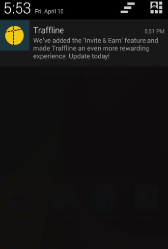
There are numerous ways of promoting an app referral program that includes push notification, email, SMS campaigns, etc. This article from our archive explores the various ways of promoting an app referral program.
User On-boarding
It is all right to accept that a good promotion would bring users to your referral program. Participation in an app referral program is a secondary step and falls in the category of engagement. 81% of users claims that they would not look back at an app if they aren’t impressed at the first go. Therefore, the manner in which you onboard your referrals becomes paramount. A few components that need special adherence while on-boarding users for your referral program include:
-
Set clear CTA (mentioned at length later). Work towards creating an urgency in the mind of your user.
-
Integrate social media icons to cut short drop-off.
-
Remove the clutter by cutting friction that may confuse the user. Complicated landing pages is one such example.
-
Create product walk-through to further assist a user.
-
Use instruments like help docs or e-mail to educate your customers about the app referral program on your website.
Call to action (CTA)
Consider a scenario in which your users have already discovered your app referral program. It’s time to think more leads and conversion. However, your analytics show otherwise!
The biggest reason for drop-offs can be attributed to a poor ‘call to action’ button. Considering that it is an important part of a user’s journey, an app marketer needs to display his ‘A’ game here. An average call to action (CTA) can be made brilliant by incorporating an eye-catching design and an impactful copy within the app’s layout.
A stellar call to action (CTA) requires patience, especially in case of an app referral program. Given the limitation of the app it is advisable to follow these guidelines
-
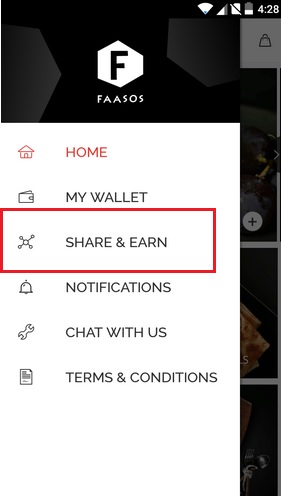
An app referral program should be easy to locate by your user. Therefore, it makes sense to place them in the most obvious location-your app’s menu. Here’s an example>
-
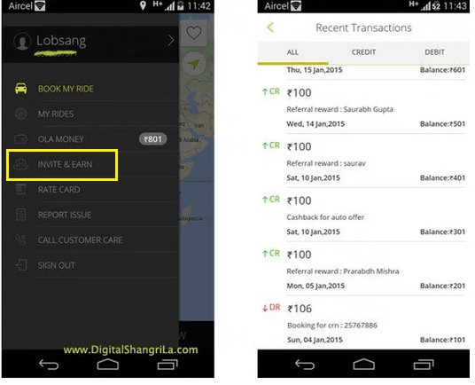
Make an attempt to highlight the call to action tab. This can be done by either using a particular color, icon or both. A powerful word/word combination that instigates your user to click instantly is a necessity. For example, OLA uses “Invite And Earn” as its chosen CTA, as compared to UBER’s “Free Ride”. Apparently we all prefer UBER more!
Image Source: http://www.digitalshangrila.com/
-
Hijack your aha moments! Clearly no one said no to referral CTA’s after they bought their favorite shoes through your app!
Ease of use
But what defines ease of use? The best way to understand this often misunderstood concept is by going back to your product’s buyer persona. Once you have revisited it, you will be in a better position to define ‘ease of use’ for your specific set of users.
Not all users are technologically adept and therefore it is always prudent to highlight a step by step process chart to help them understand it quickly. Apart from a clear process users should be able to share their referral links through social media channels, and referral codes swiftly.
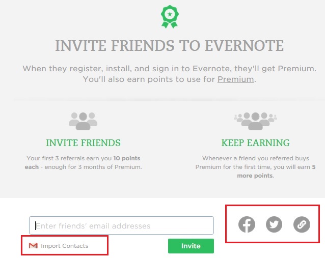
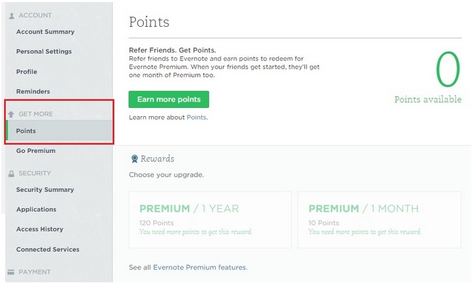
On the web front, Evernote is a great example. Users can share their referral links in an effortless manner with their friends. Another highlight of the Evernote program is the simple ‘import contact’ hack that is intelligently placed at the bottom of its referral program. Evernote has also ensured that the ‘point summary status’ is easily available for users to view.
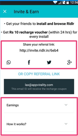
The same is possible for your app users as well. Here’s an example of a mobile referral design that makes it easy for a user to share the referral link. Note that the users can see their earnings at all times. Apart from this they can also view details of friends who have signed up using their referral links.
All this is available to them on the same screen. This is possible only when marketers invest quality time in developing their in-app share page.
Reward disbursement
Every user has a vested interest when it comes to a referral marketing program. While they love the product, it is also the incentives that drive them to recommend it. Reward disbursement hence becomes crucial. Here’s a thing or two to manage it better:
-
Highlight the reward in a precise manner. Another important task is to invest enough hours on coding the terms and conditions. This will cut short any ambiguity at a later stage.
-
Notifying users by email or push notifications after they have participated in your referral program is always appreciated.
-
Ensure that the reward disbursement is updated in real time. Users want to see it instantly.
Personalized links
What’s common between Airbnb and UBER’s referral program? Apart from their vast popularity, it is their emphasis on personalized links that sets them apart. We all love things with a face and referral links aren’t any exception. According to Airbnb’s famous blog
“We thought that with personalized referral codes and URLs, users would feel more ownership of their invitation landing pages and emails.”
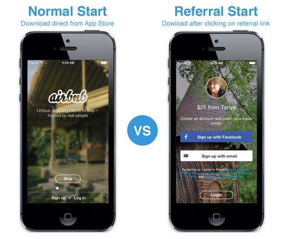
True to the thought, it worked wonders for them. If you are a follower of ‘one size fits all’ theory, the image below will make you re-think your referral marketing strategy.
Image source: http://sarlitt.me/
As a result of introducing personalized links, Airbnb increased its user signups and booking by over 300% per day!
Others brands that have successfully integrated personalization (with the image of the referrer in their app) include Shyp, Instacart and Munchery amongst others.
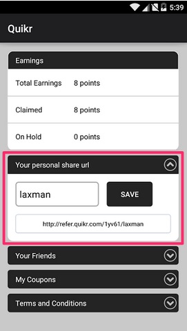
Another element of personalization is ‘personalized links’. Users can create personalized links that helps them to connect with their audience instantly. Here’s an example
Check the way in which this link highlights the name of the referrer.
Both these aspects are discussed in this informative article.
AppVirality helps developers in powering apps with fully automated and easy to run in-app referrals with personalized links.
The Final Thoughts
Referral Marketing is the star attraction of any successful campaign today. Not only does it help in attracting new users, but also in nurturing them. App marketers that realize this aspect have included it as an integral part of their arsenal today.
A good referral marketing program requires endless amounts of testing and refinement. However, the techniques mentioned above can not only bring in more users to the table, but it can also define the way we look at them!
Leave your love in the form of feedback and comments below!

